MANUS MANUM LAVAT
Graphic Design
2023


Role: Design Direction / Graphic Design
Location: London, United Kingdom
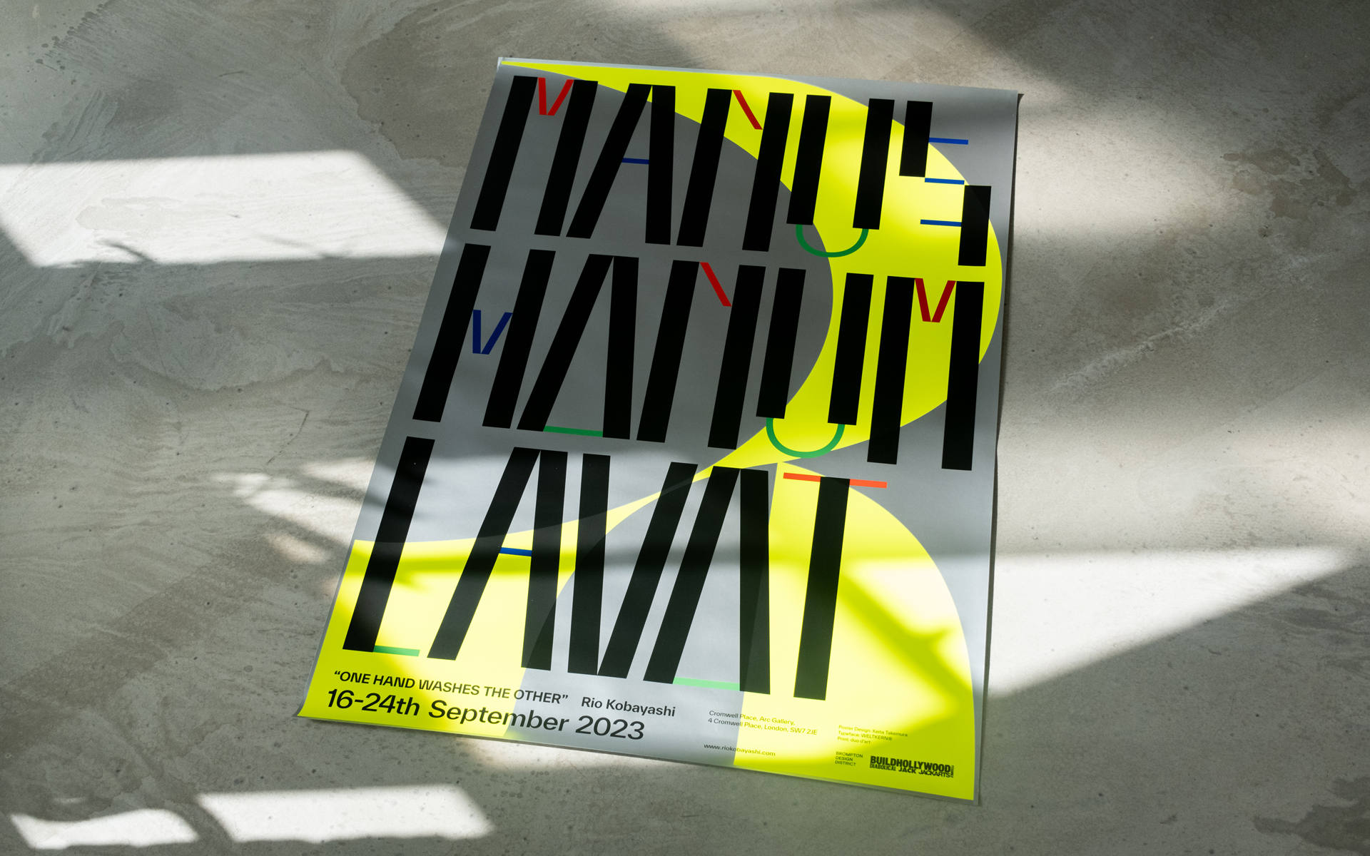
"MANUS MANUM LAVAT" is a poster crafted for the debut solo exhibition titled "MANUS MANUM LAVAT (one hand washes the other)," featuring the works of Rio Kobayashi, a furniture designer based in London.
A salient feature that emerged from our conversations was Rio's inspiration drawn from Memphis Design, a design movement that proliferated mainly in Italy during the 1980s. Designers at the heart of this movement were known for their use of bright, vibrant, and stimulating colours, and complex, organic shapes. Within this context, graphic designers also played a role, with Christoph Radl creating the Memphis logo. This current "MANUS MANUM LAVAT" typography is an homage to some of his works, organically shaped and coloured in a diverse palette. It modernises and elevates the past design movement. Mirroring Memphis's style, practical elements were removed in favour of prioritising humour, resulting in the successful creation of a unique and iconic typography.
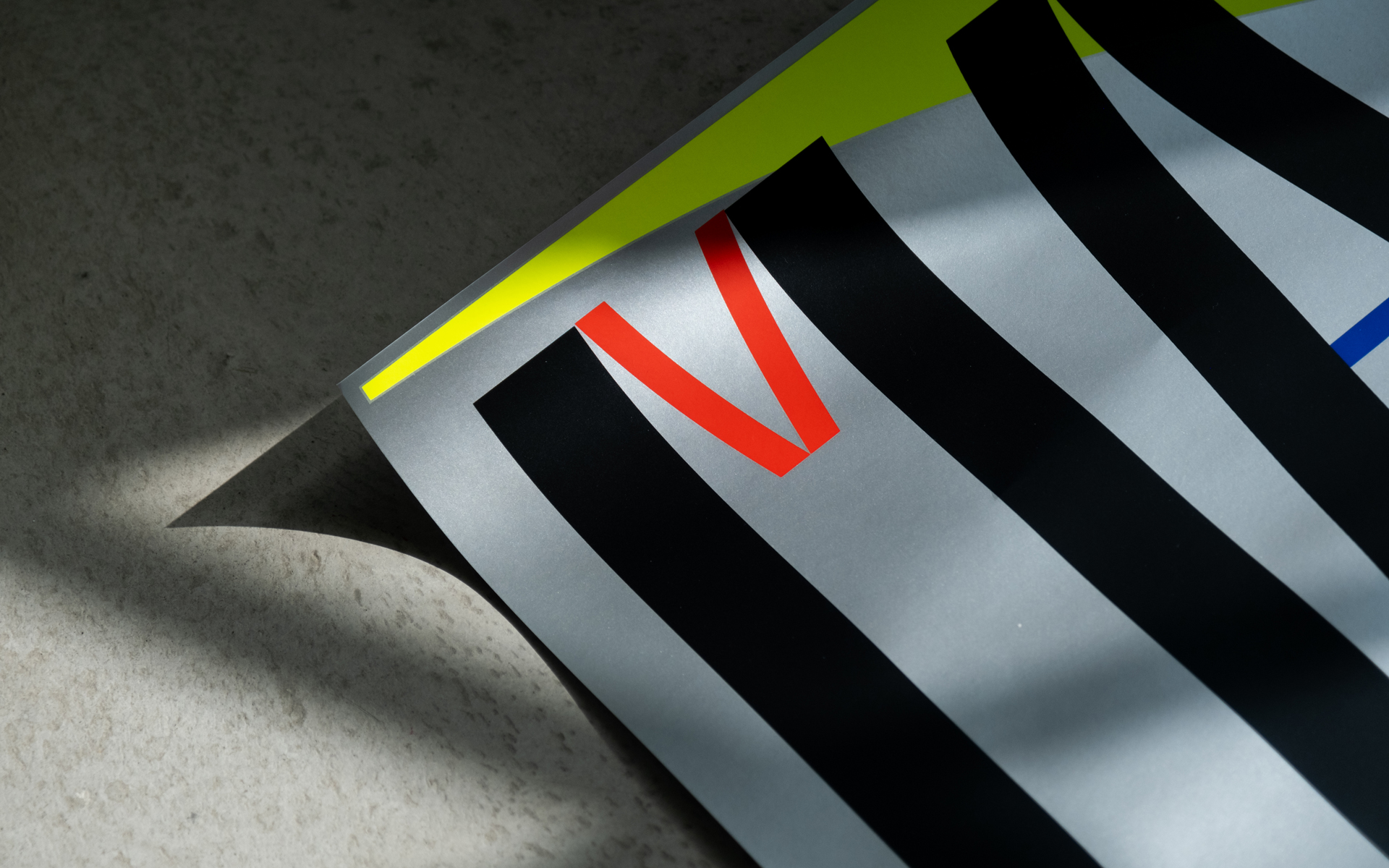
Given that this exhibition focuses on furniture design, attention was also directed towards materials. The poster design's background utilises silver and fluorescent colours to fully exploit the potential of paper as a medium. This imbued the poster with a novel Memphis Design style not present in the '80s, symbolising Rio's exhibition with a high-quality representation.