Keita Takemura is a London–based Design Director & Designer. He has been working on brand identities, books, magazines and websites for cultural institutions, publishers, and corporations. Communication Arts and Creative Review have recognised his work. He and his team received the ADC Awards Bronze Cube in 2022.
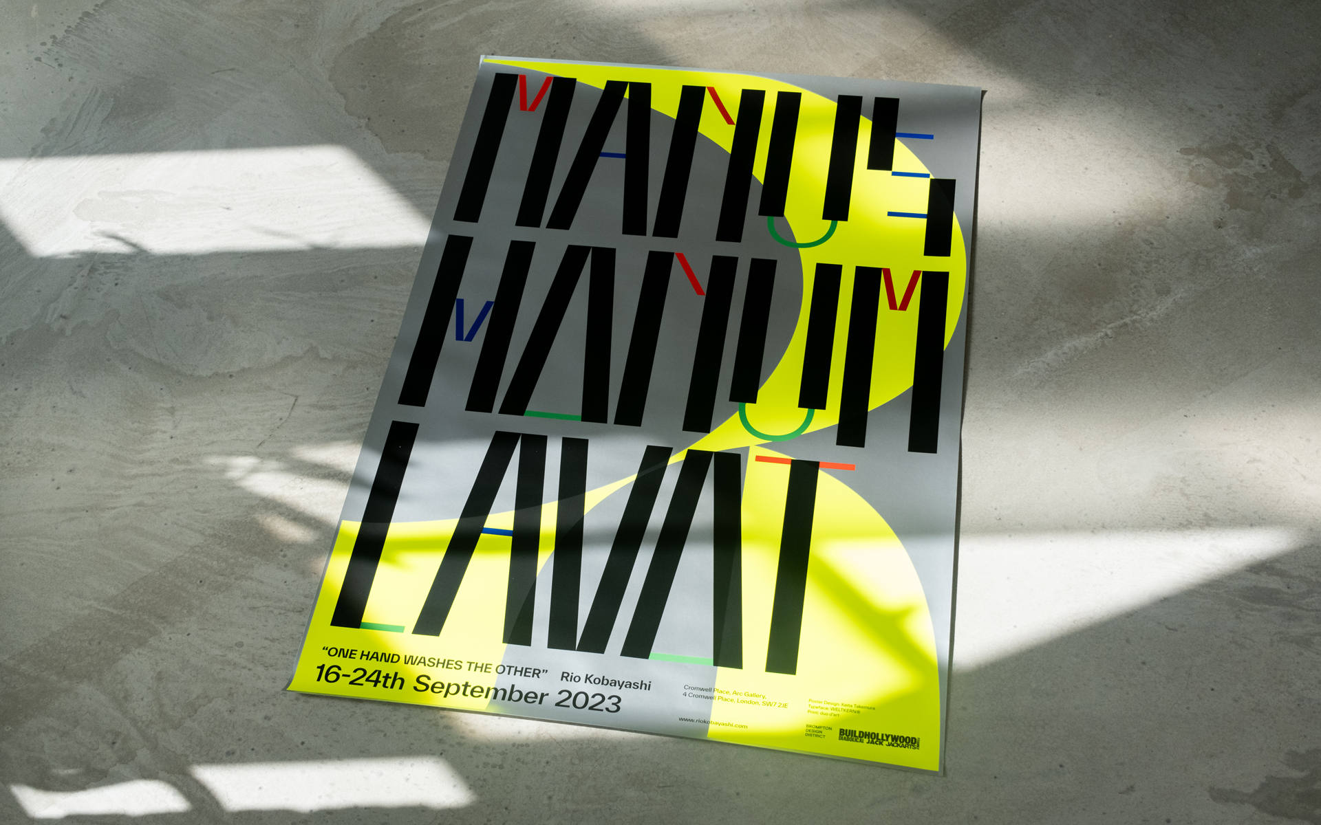
MANUS MANUM LAVAT
Graphic Design
2023

Role: Design Direction / Graphic Design
Location: London, United Kingdom
"MANUS MANUM LAVAT" is a poster crafted for the debut solo exhibition titled "MANUS MANUM LAVAT (one hand washes the other)," featuring the works of Rio Kobayashi, a furniture designer based in London.
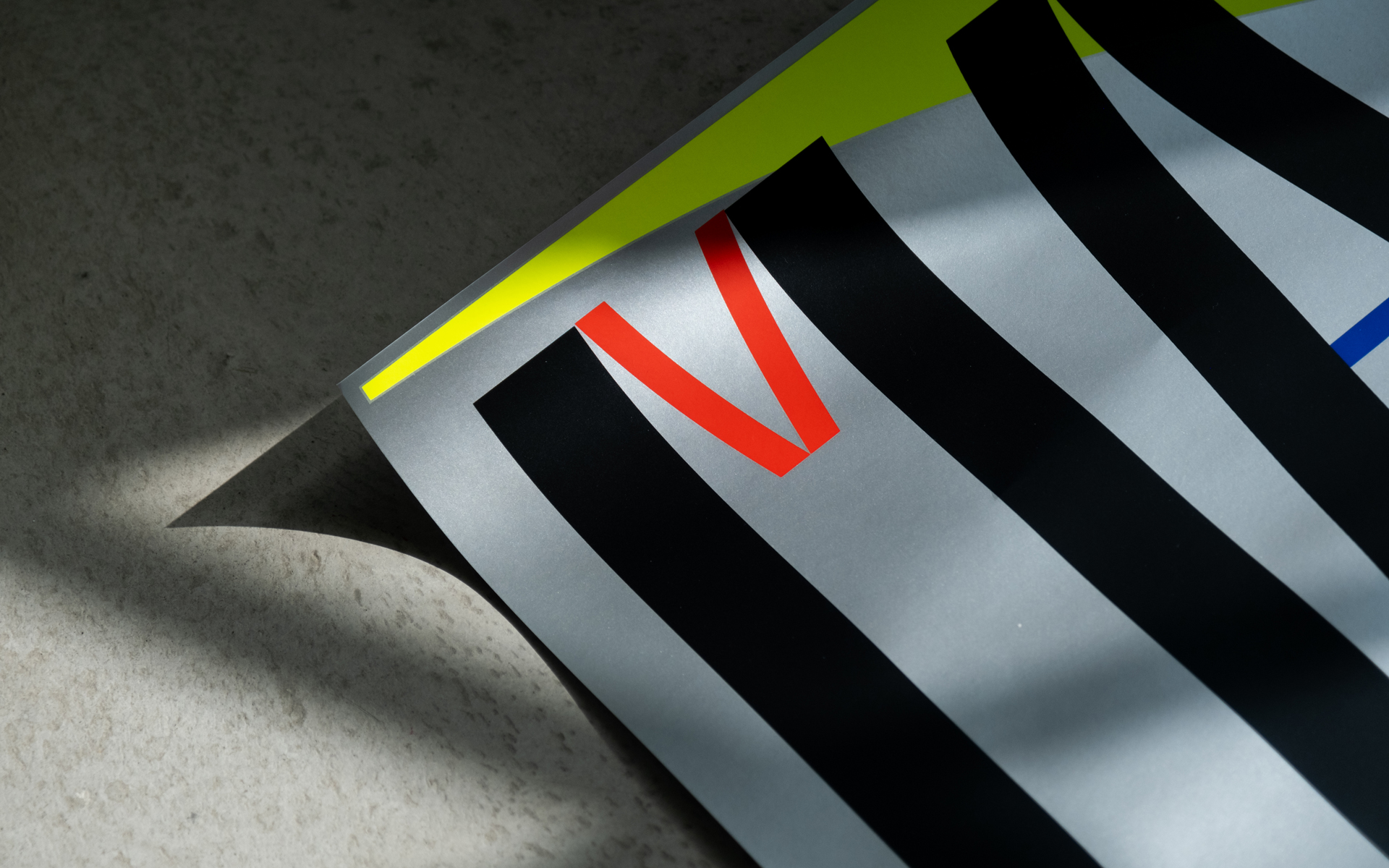
A salient feature that emerged from our conversations was Rio's inspiration drawn from Memphis Design, a design movement that proliferated mainly in Italy during the 1980s. Designers at the heart of this movement were known for their use of bright, vibrant, and stimulating colours, and complex, organic shapes. Within this context, graphic designers also played a role, with Christoph Radl creating the Memphis logo. This current "MANUS MANUM LAVAT" typography is an homage to some of his works, organically shaped and coloured in a diverse palette. It modernises and elevates the past design movement. Mirroring Memphis's style, practical elements were removed in favour of prioritising humour, resulting in the successful creation of a unique and iconic typography.
Given that this exhibition focuses on furniture design, attention was also directed towards materials. The poster design's background utilises silver and fluorescent colours to fully exploit the potential of paper as a medium. This imbued the poster with a novel Memphis Design style not present in the '80s, symbolising Rio's exhibition with a high-quality representation.
Role: Design Direction / Graphic Design / Web Design
Developer: Makoto Masui
Typeface: Studio Feixen - Noi Grotesk, Monotype - Tazugane Info
Location: Tokyo, Japan
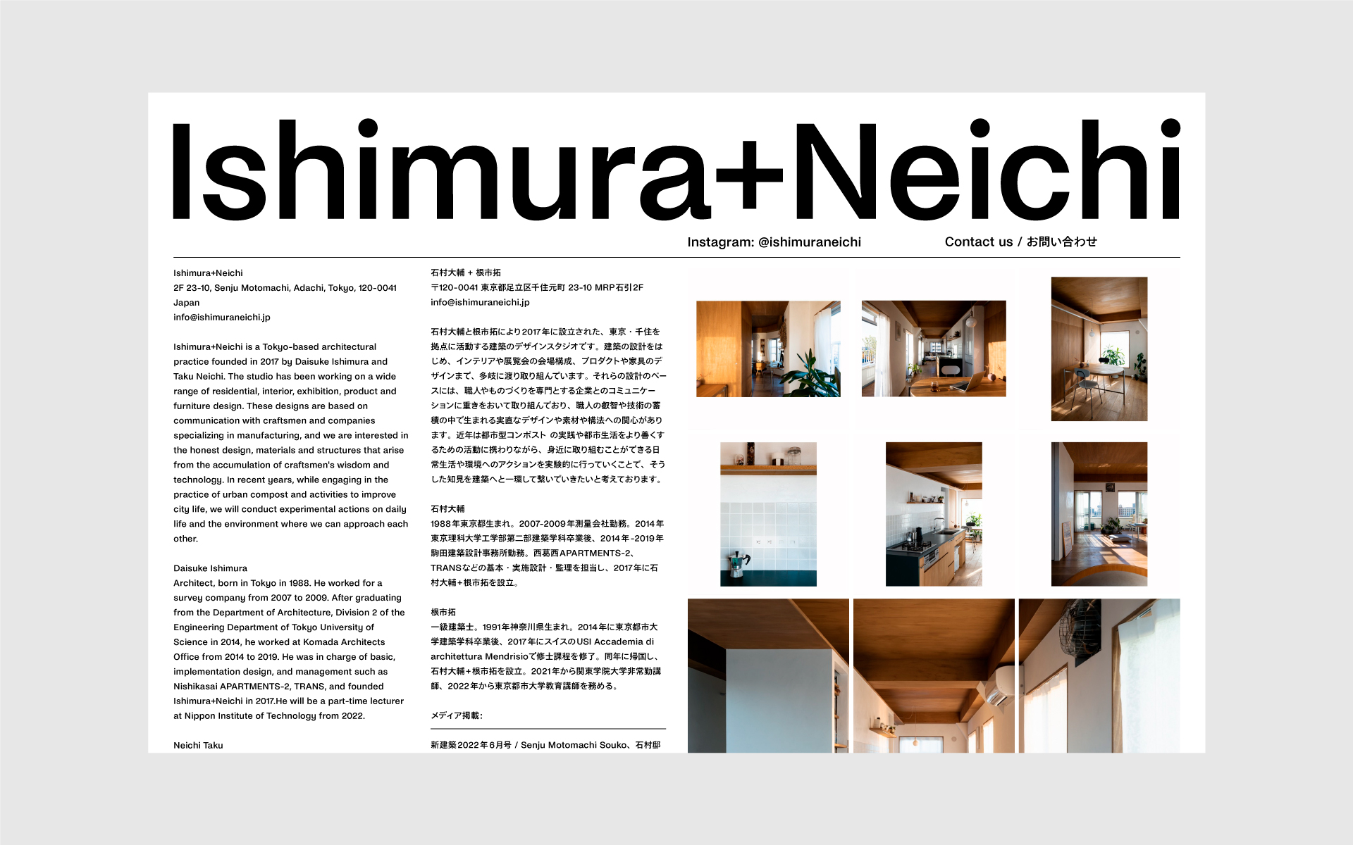
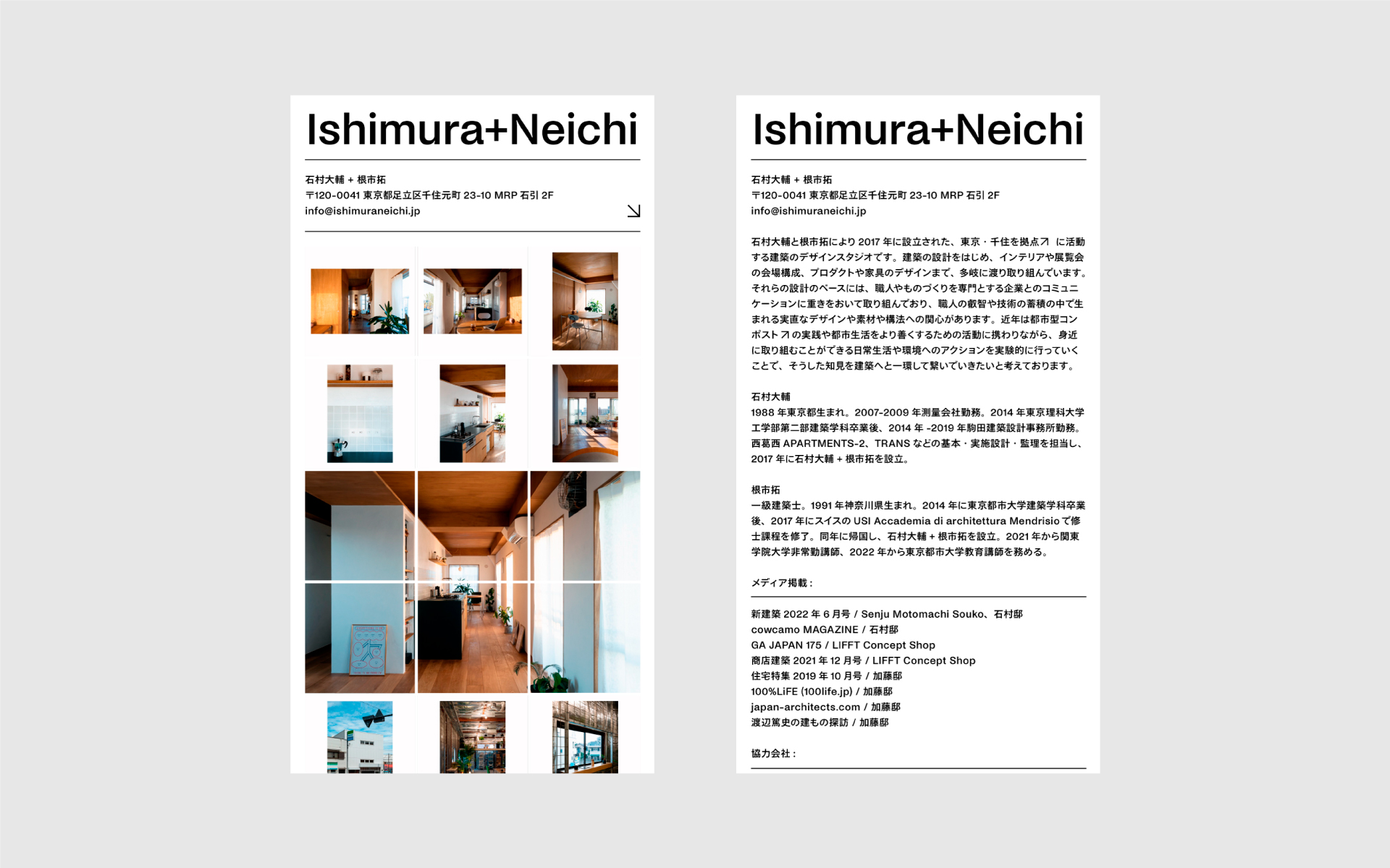
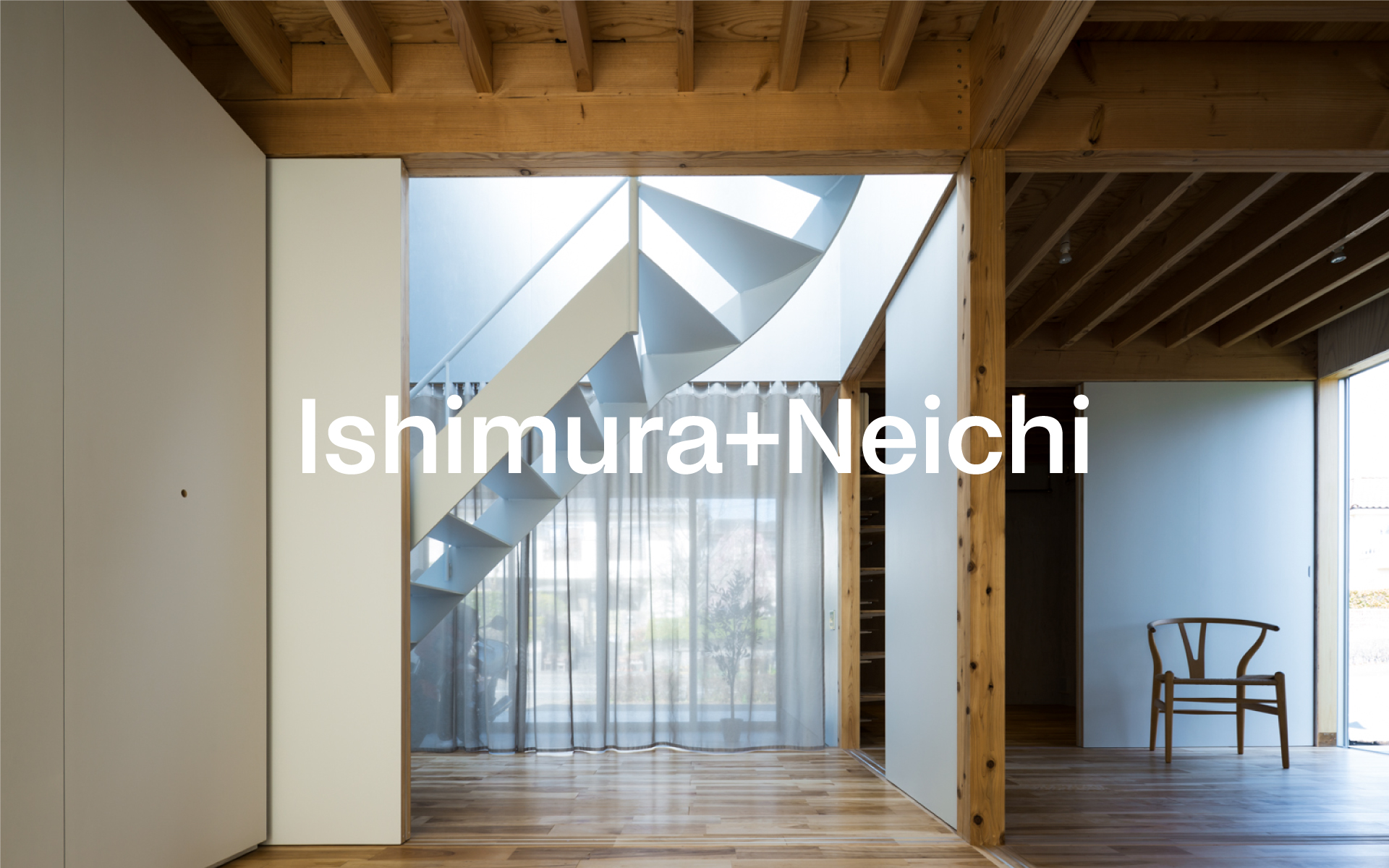
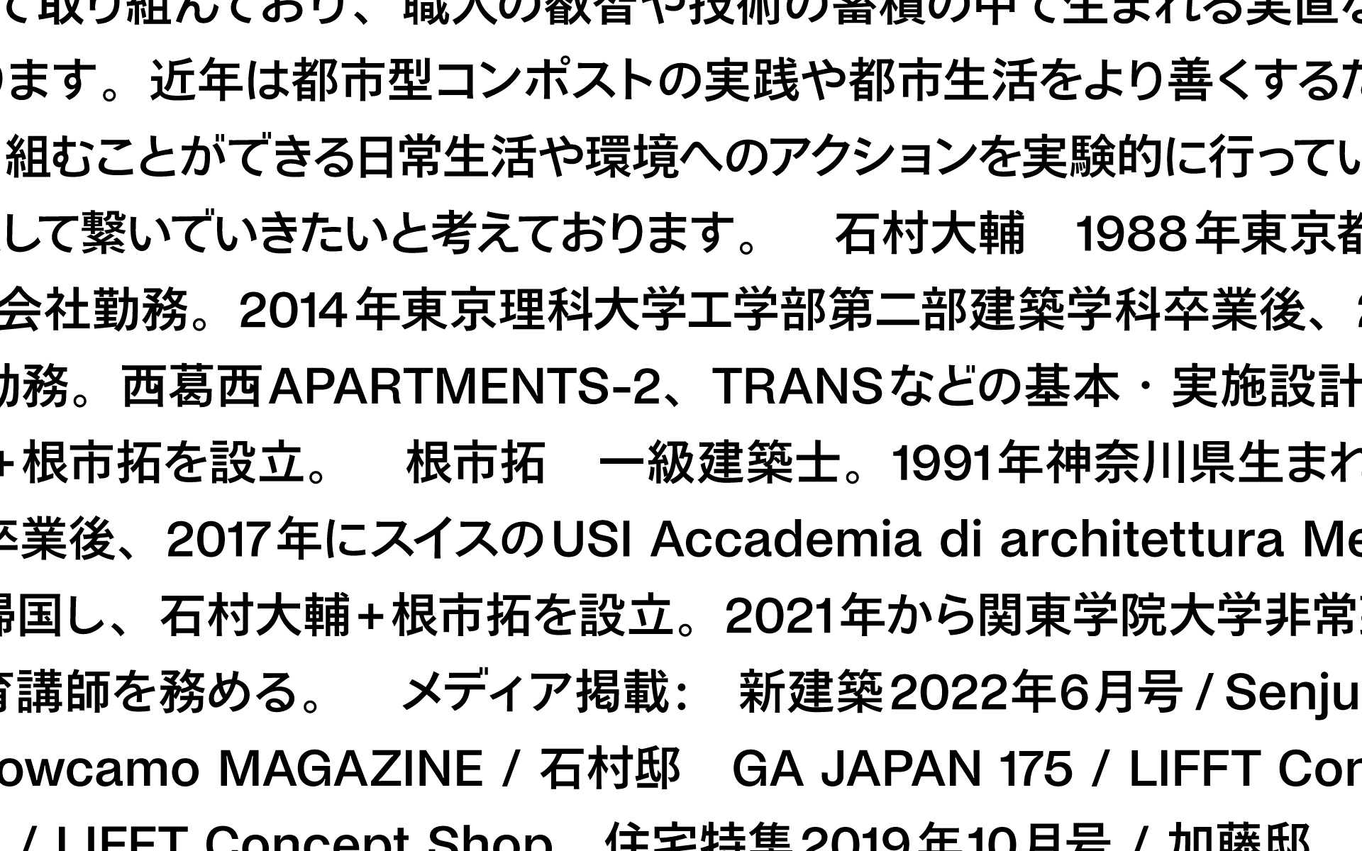
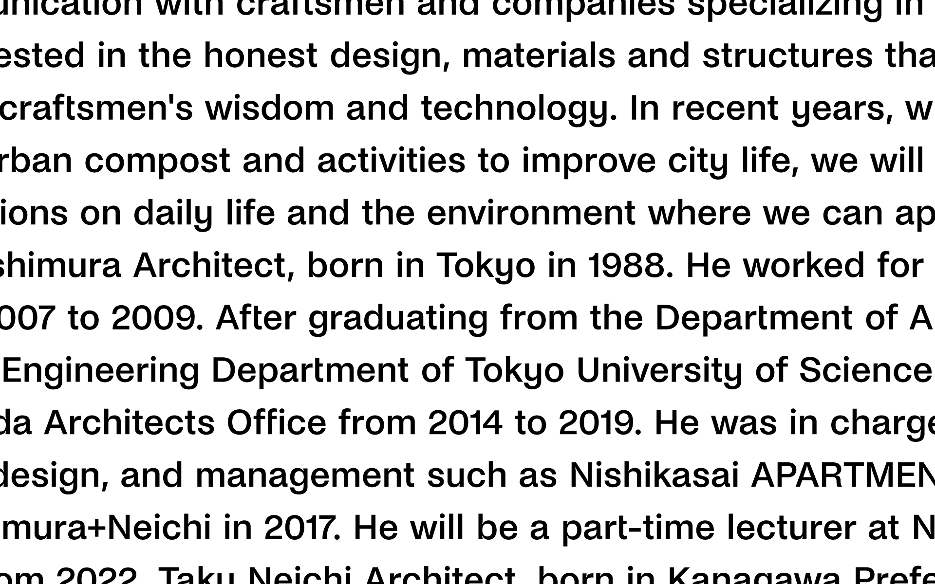
Ishimura+Neichi is a Tokyo-based architectural practice. The studio has been working on a wide range of residential, interior, exhibition, product and furniture designs. The visual identity was produced around a website. The website expresses both ease of access to information and memorable typography on a single page. Noi Grotesk by Studio Feixen was used for the English text, and Tazugane Info by Monotype was used for the Japanese text. Each typeface was selected and produced with attention to fine detail representing its philosophy.
Award: Site of the day - Mind sparkle Mag
Featured: The Brand Identity, Mindsparkle Mag, Klikkenthéke, Typeroom.eu
THE ATTICO
Graphic Design
2022
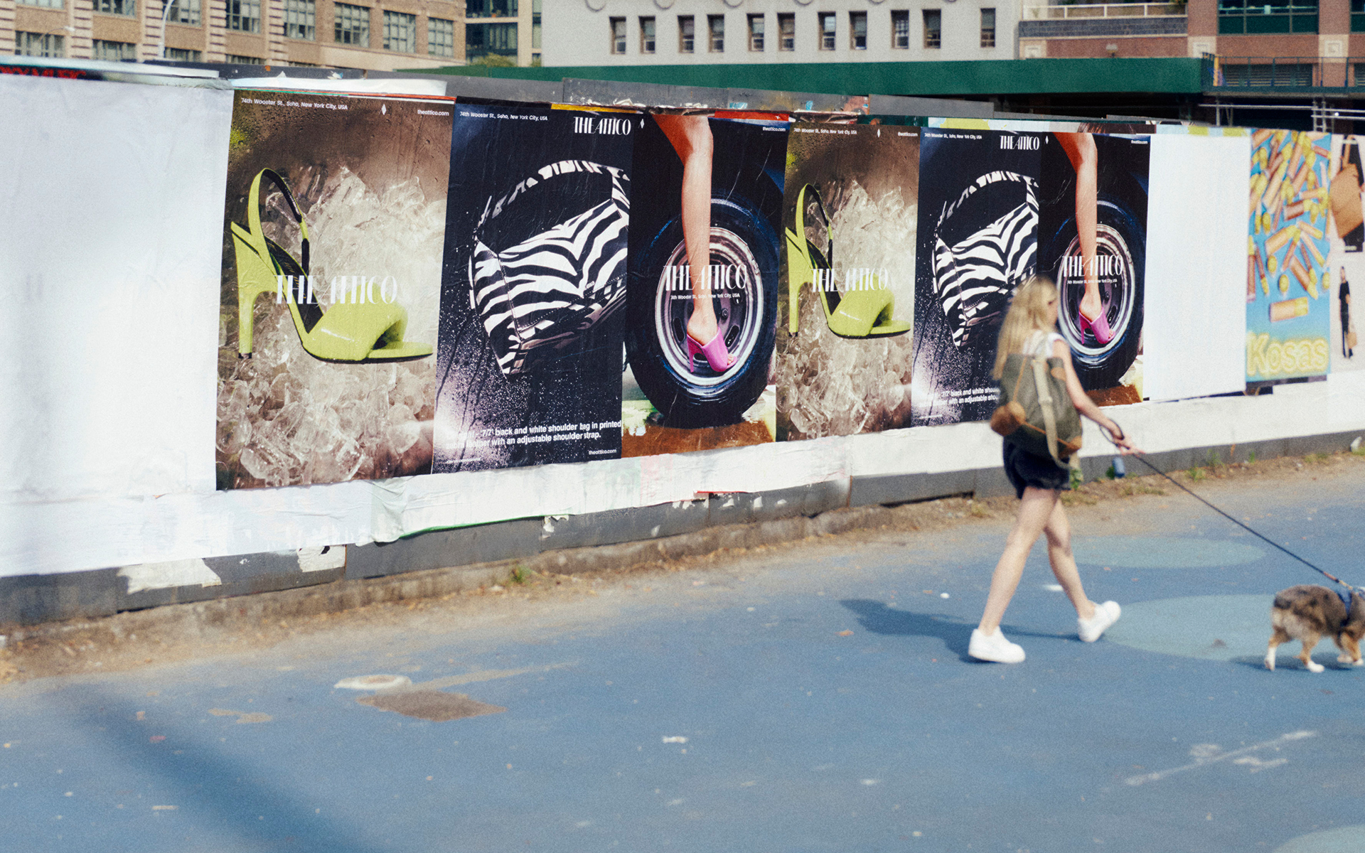
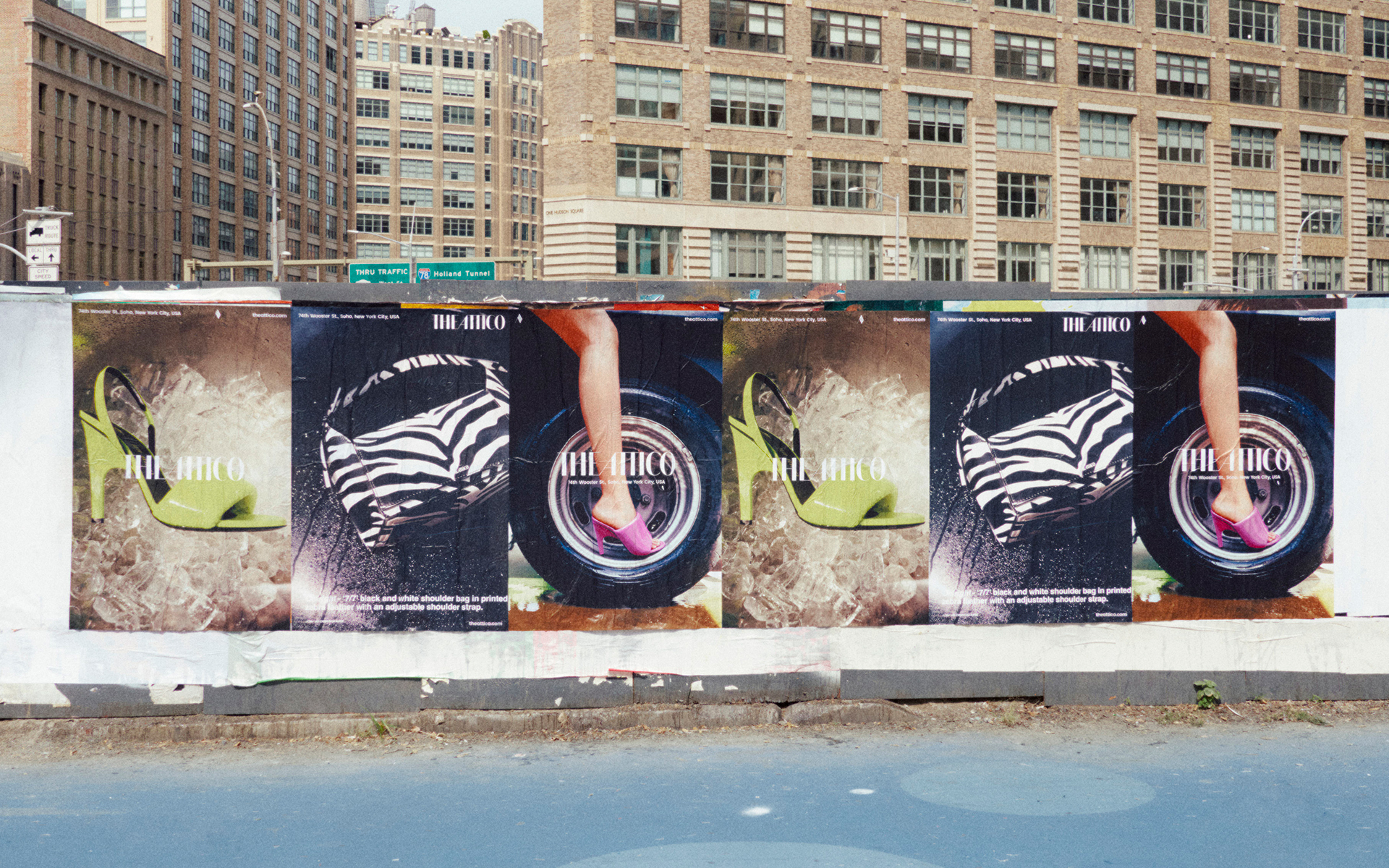
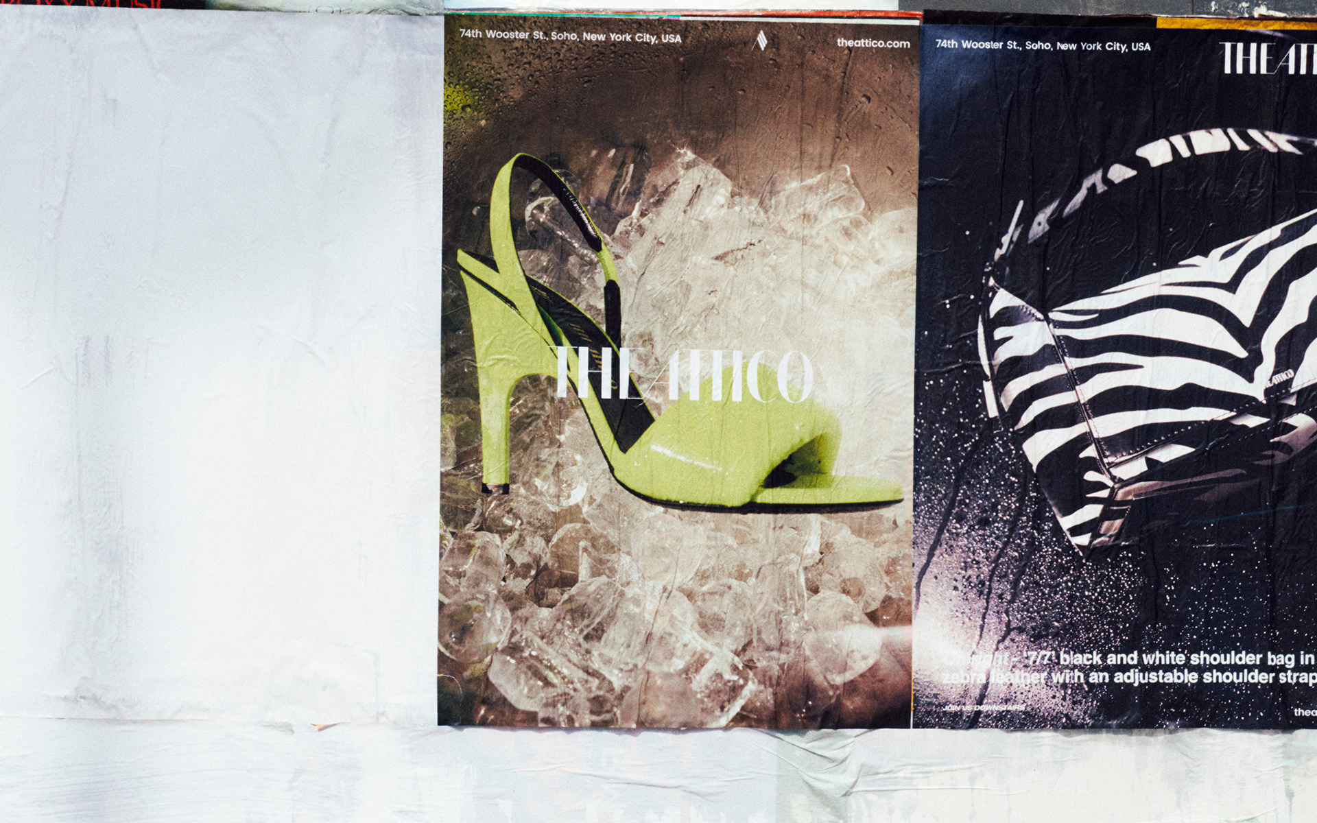
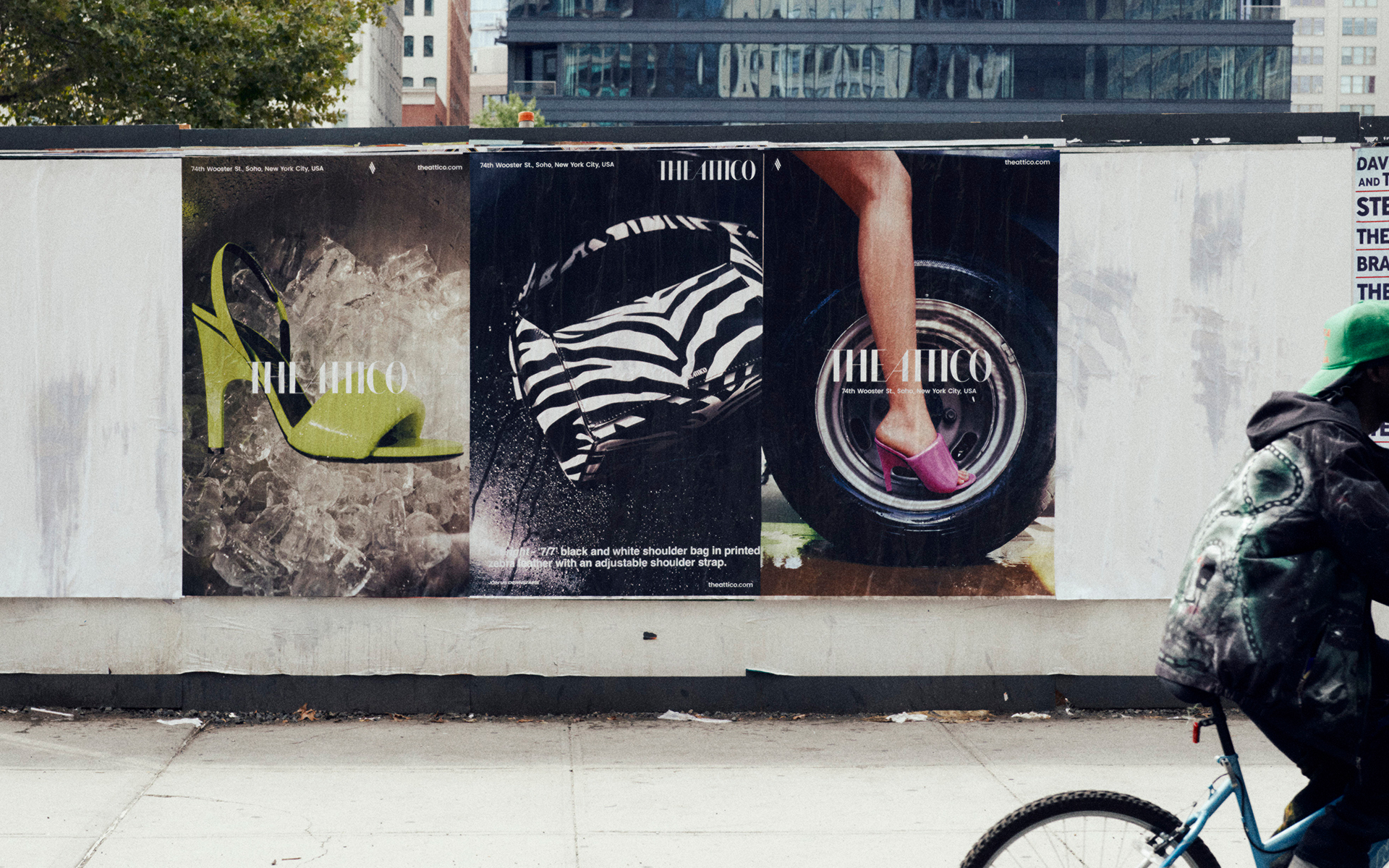
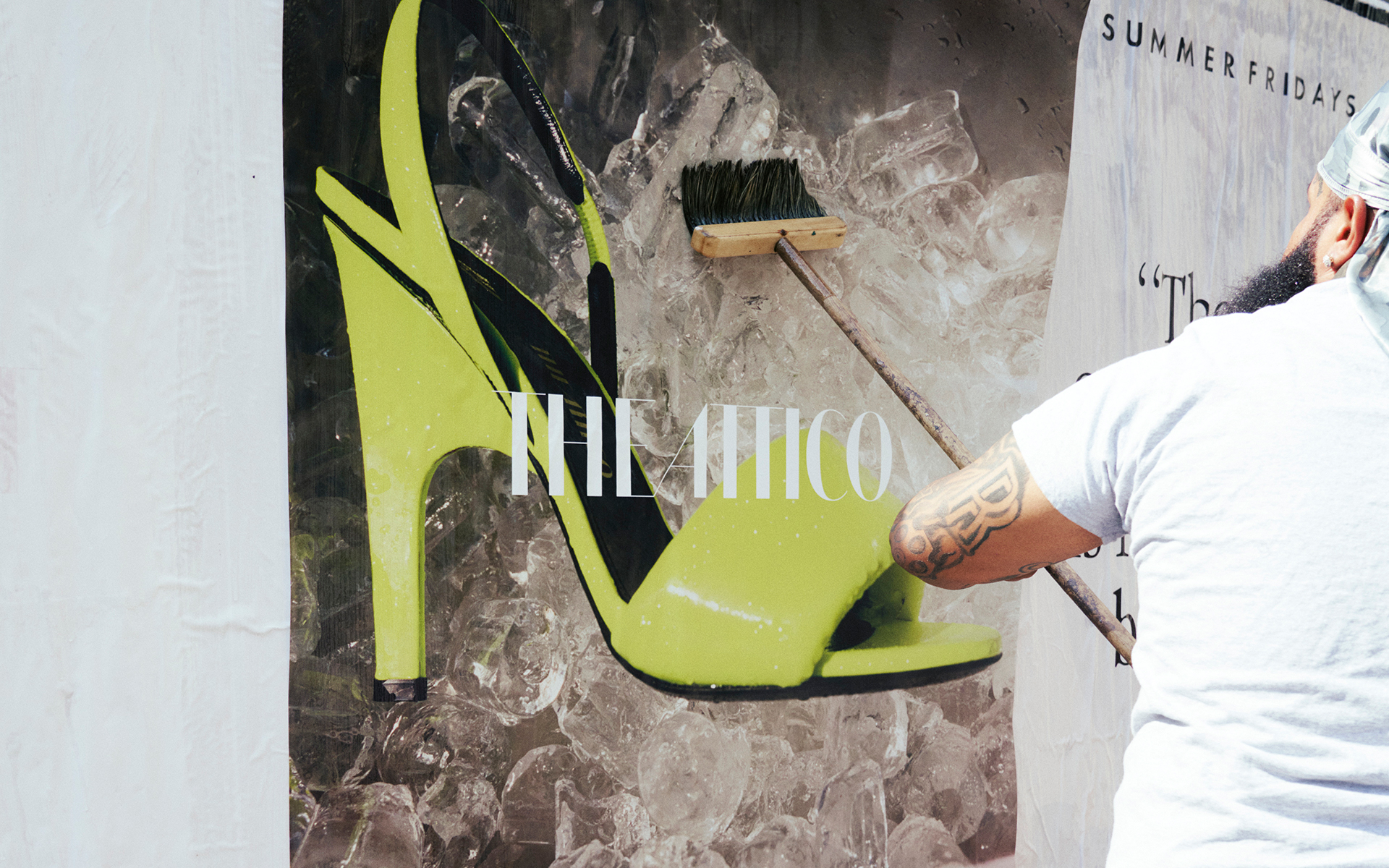
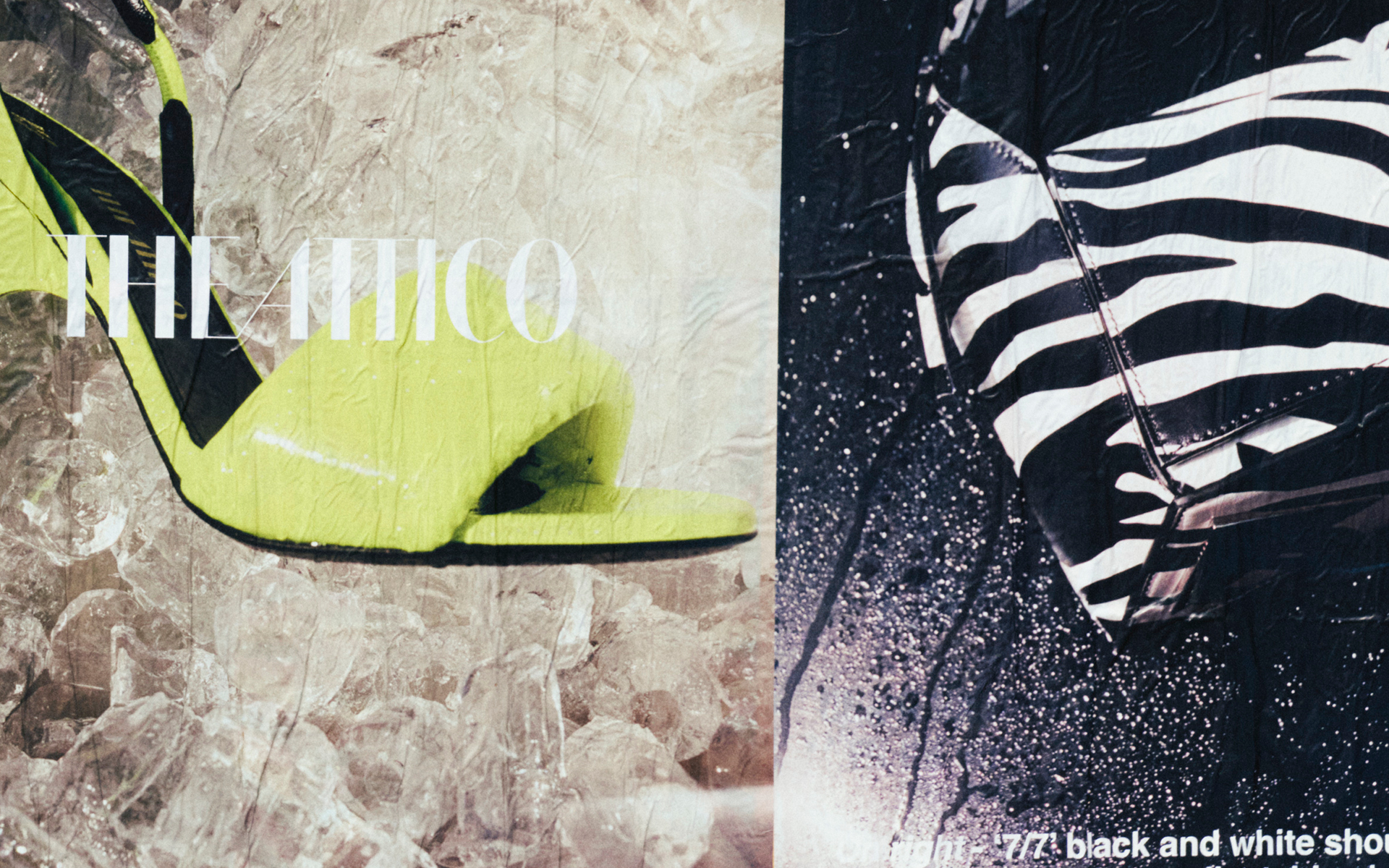
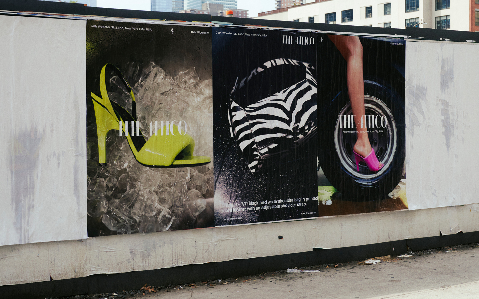
Role: Graphic Design
Art Direction: Louis Burguet
Location: New York, United States
THE ATTICO is a global fashion label from Italy. For the opening of THE ATTICO's first New York shop, I designed three different guerrilla posters and billboard advertisements. Under the art direction of French agency Louis Burguet Studio, the work was produced with attention to proportion down to the millimetre.
THE ATTICO
Graphic Design
2021
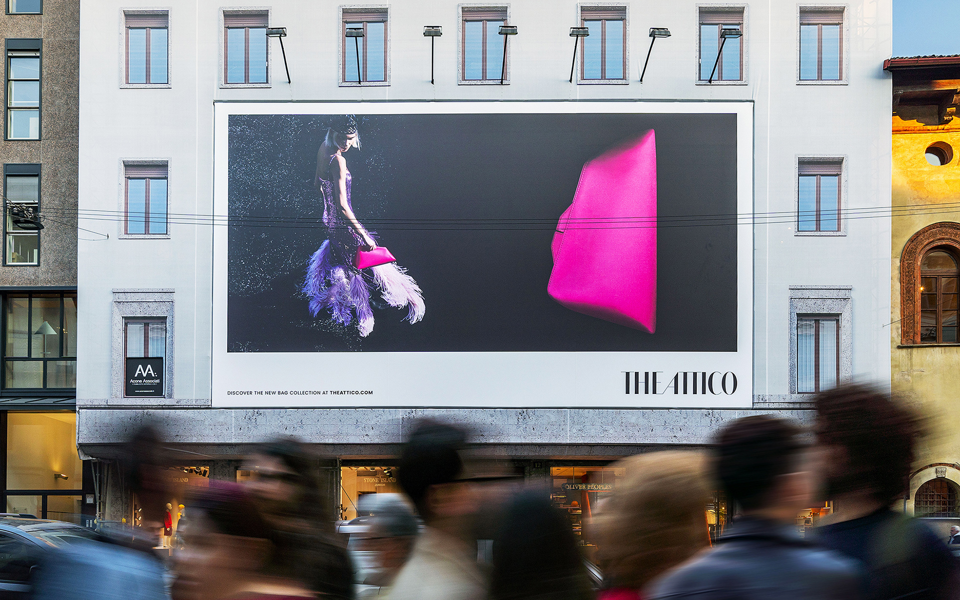
Role: Graphic Design
Art Direction: Louis Burguet
Location: Milan, Italy
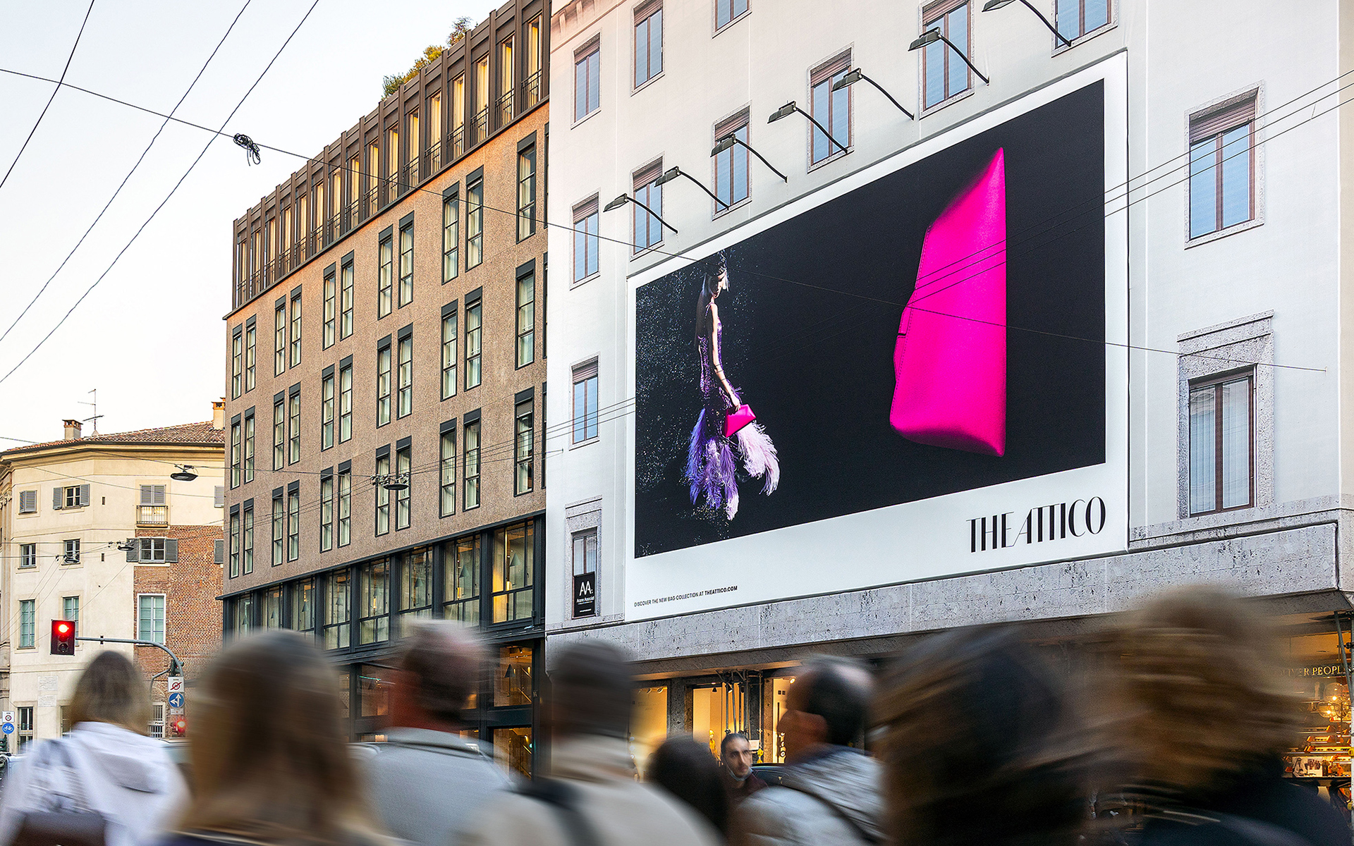
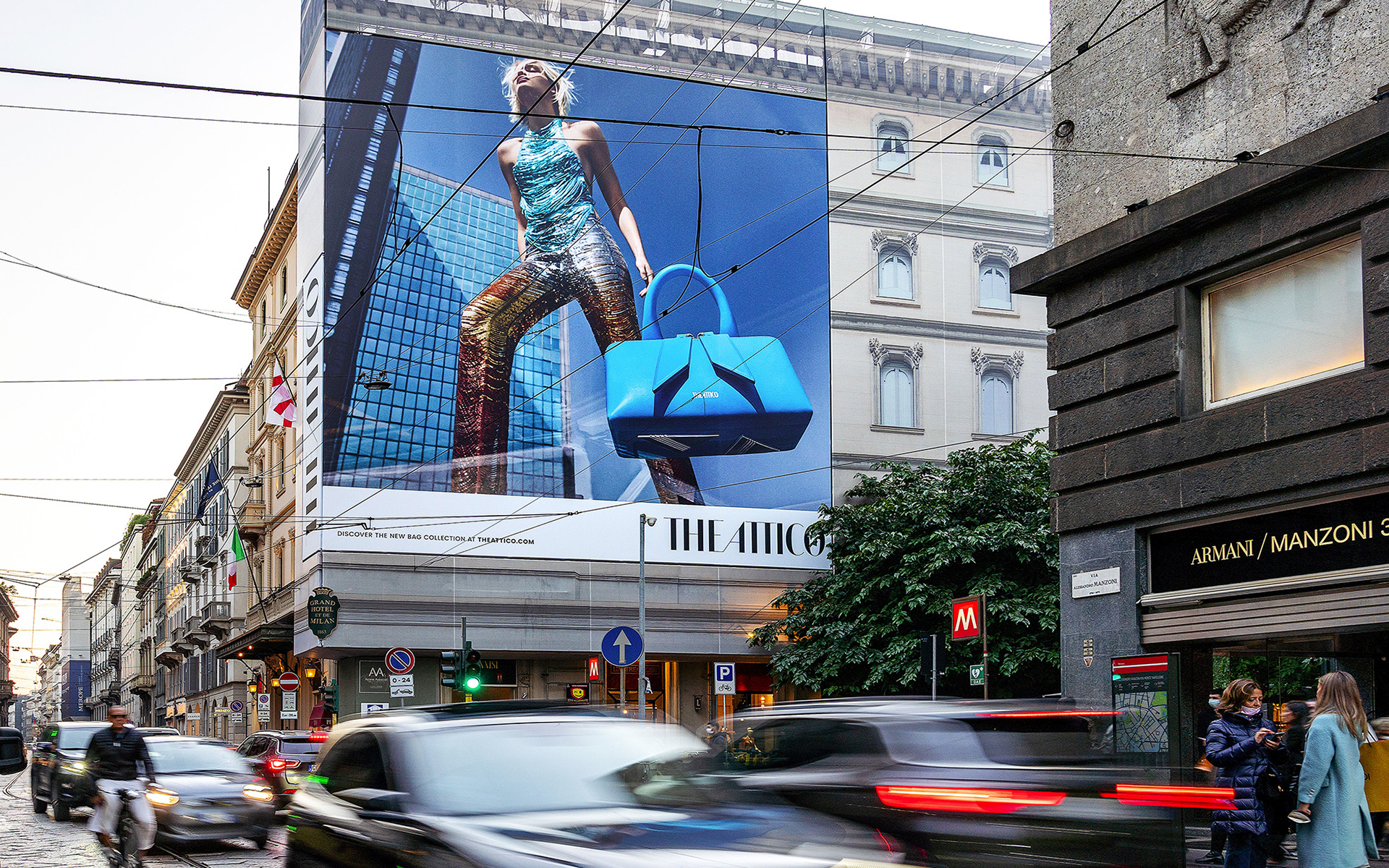
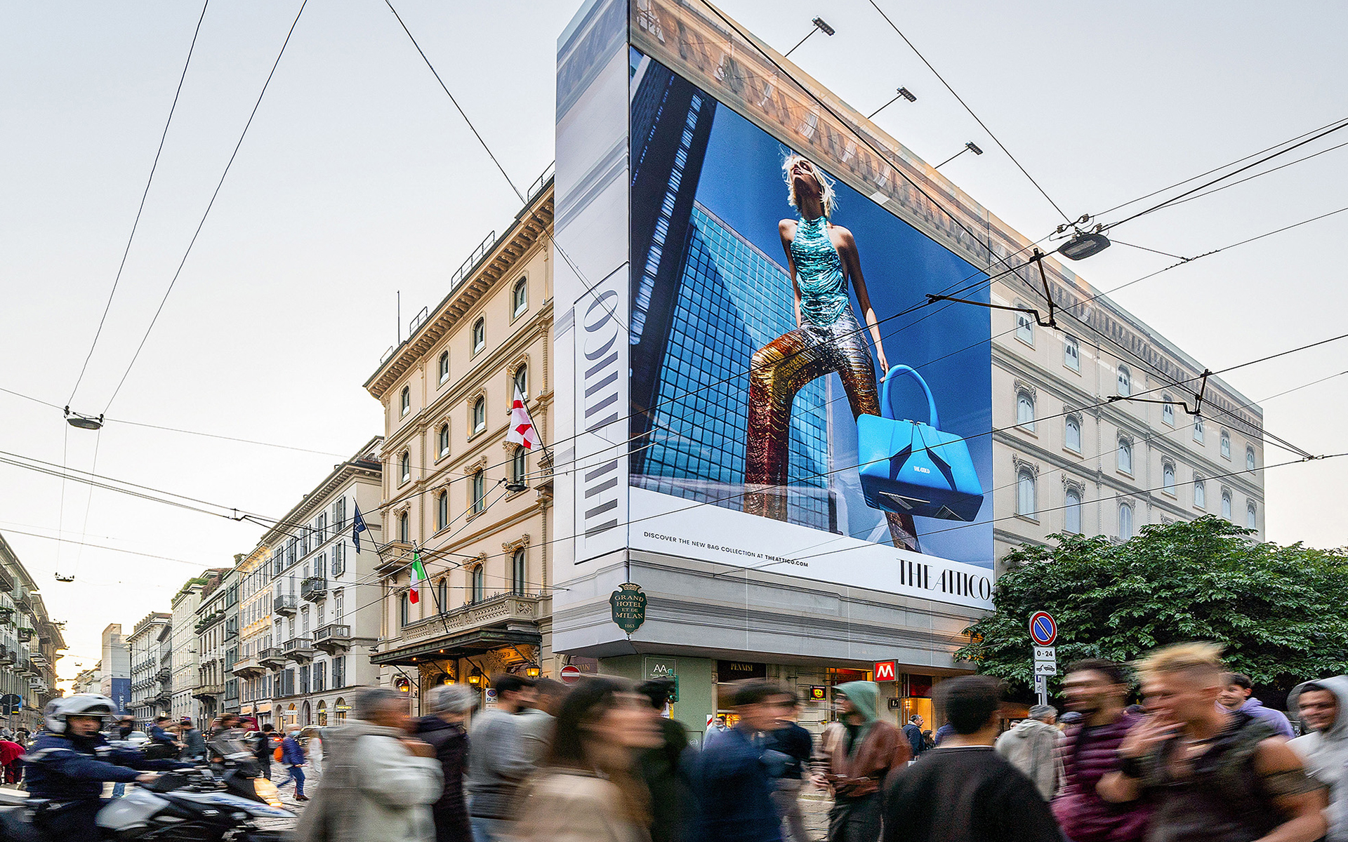
THE ATTICO is a global fashion label from Italy. I produced graphic designs for billboard advertisements. Under the art direction of French agency Louis Burguet Studio, the work was produced with attention to proportion down to the millimetre.
Art Direction: Louis Burguet
Location: Milan, Italy
THE ATTICO is a global fashion label from Italy. I produced graphic designs for billboard advertisements. Under the art direction of French agency Louis Burguet Studio, the work was produced with attention to proportion down to the millimetre.
British Film Institute
Campaign Visual
2021

Role: Design Direction / Graphic Design
Creative Direction: Darren Wood, Nariaki Kanazawa
Animation Creative Direction: Yuki Matsushima
Animation Direction: Susumu Yamaguchi
Animation Produce: Kenichiro Goto, Tomoya Iwasawa
Illustration: Tatsuya Kondo
Location: Nationwide, UK
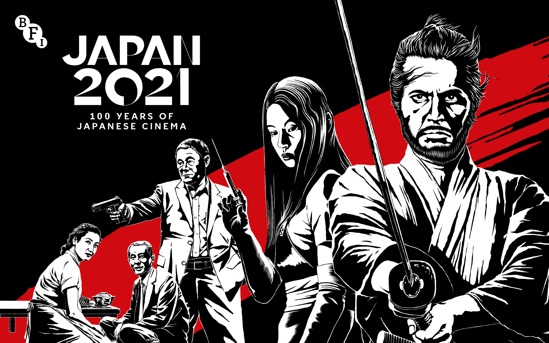
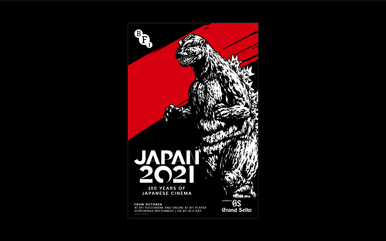
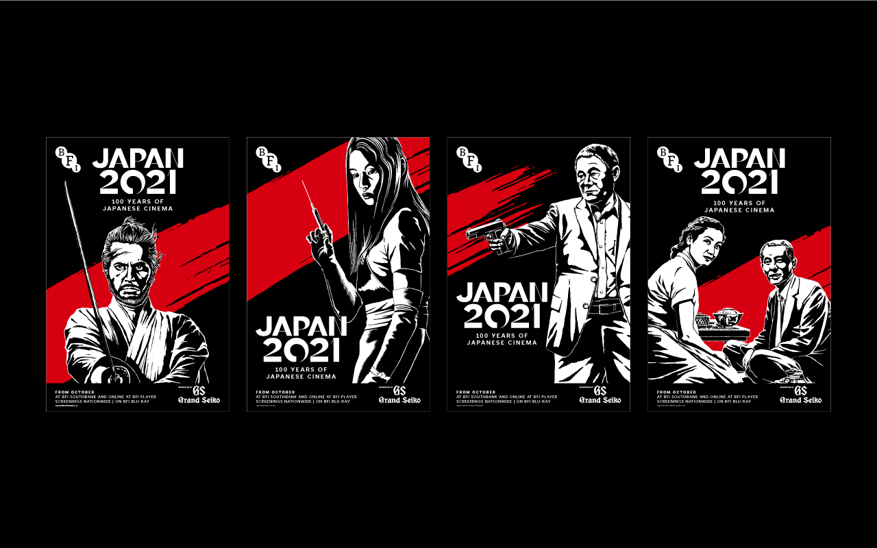
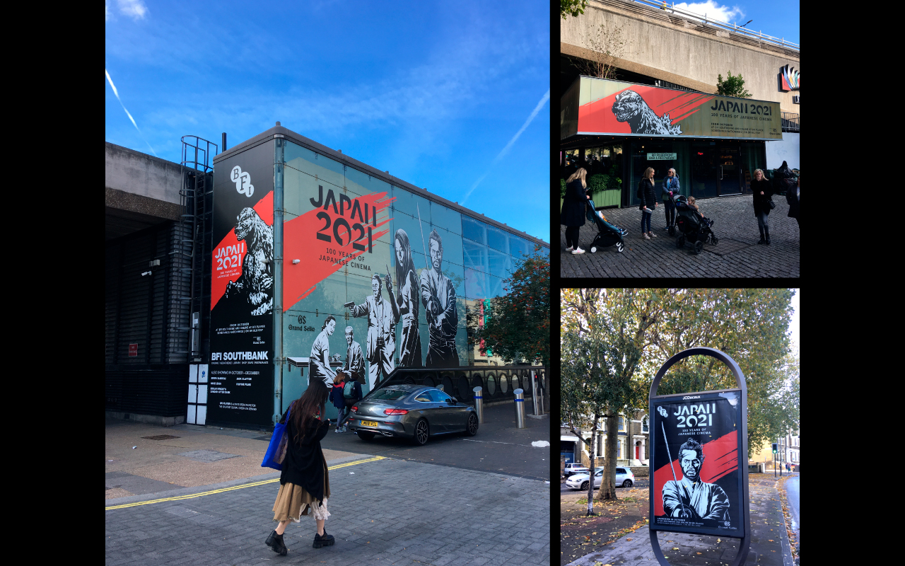
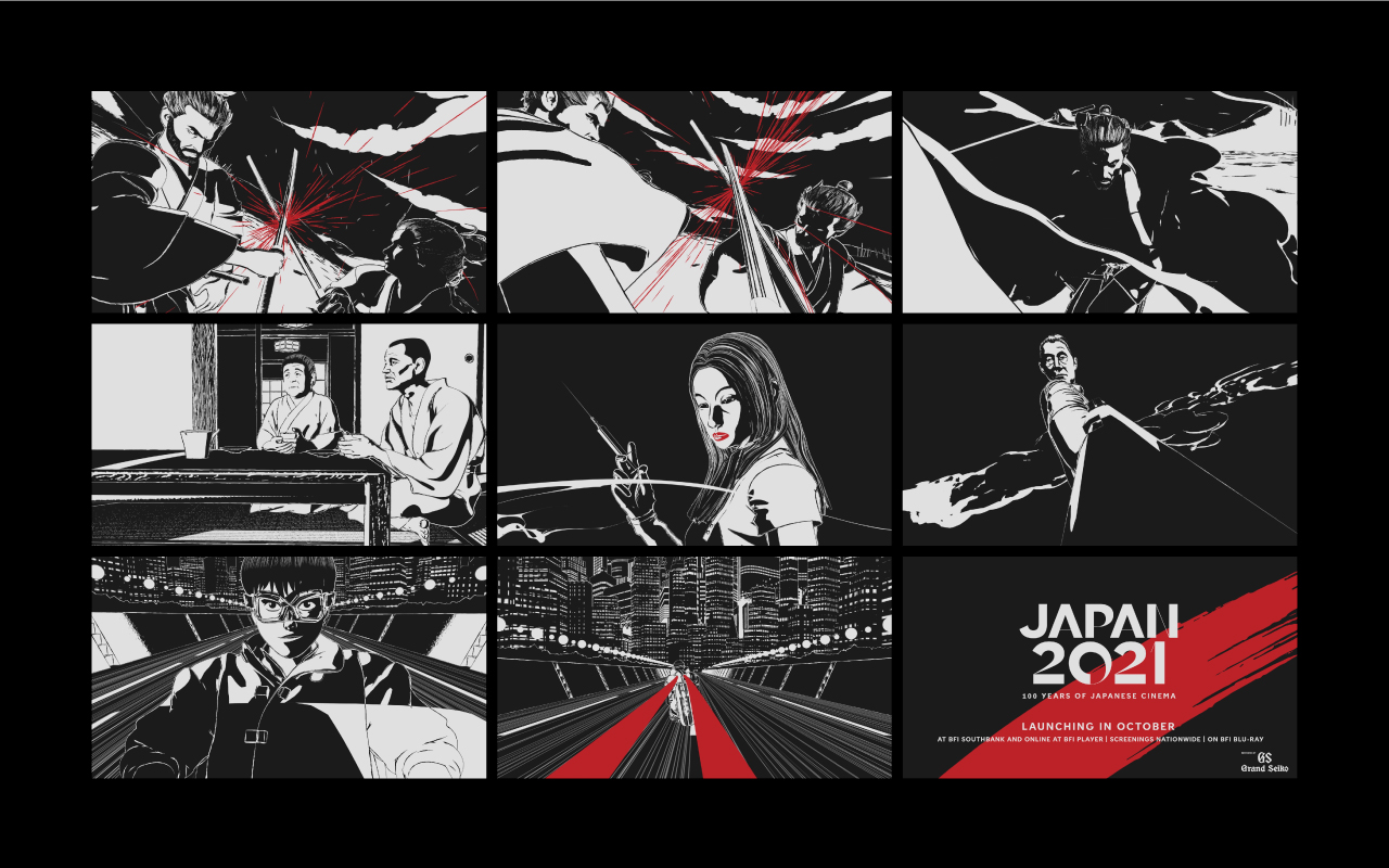
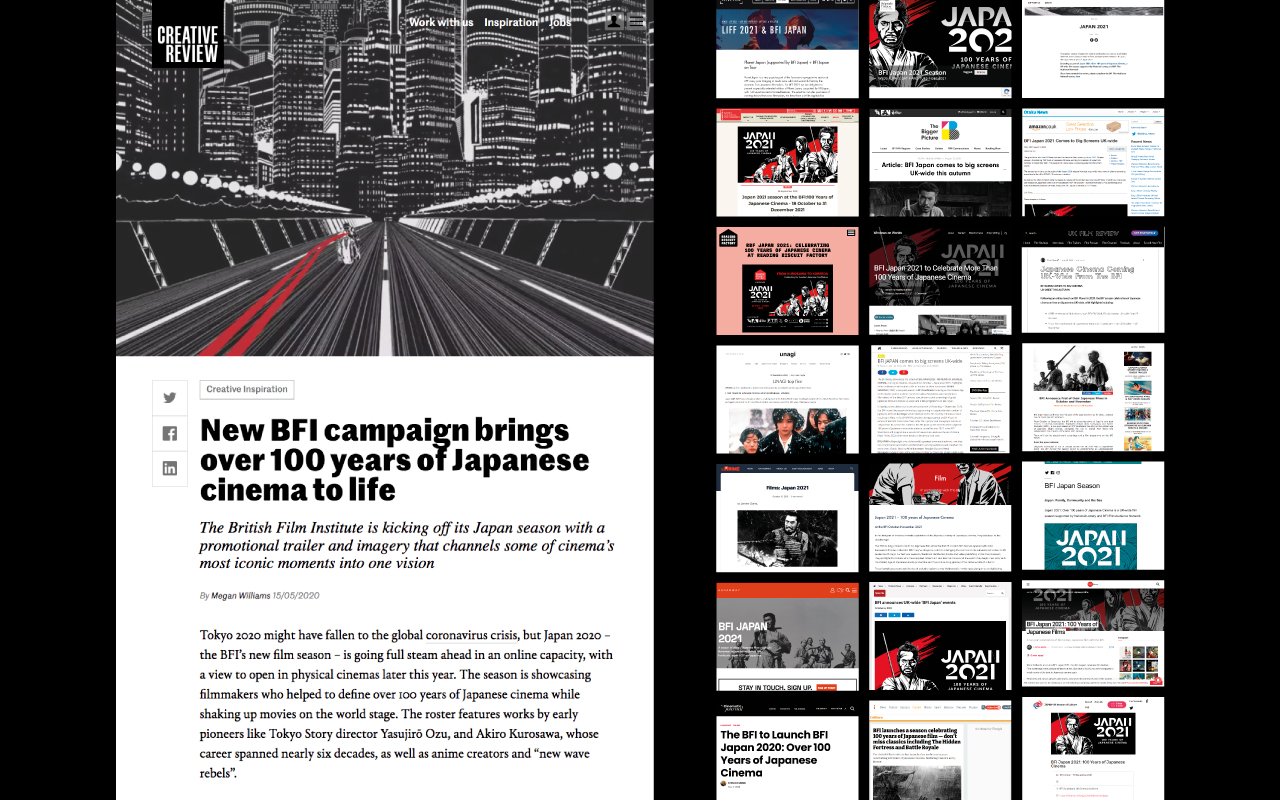
JAPAN 2021 was a Japanese film campaign by the British Film Institute carried out from 2020 to 2021 across the UK. The project focused on over 100 years of Japanese film through cinema seasons, online exhibitions, theatrical releases and education events. We used archetypes from different film genres to create an overarching traditional and modern design style. The illustration style allowed us to create a really strong and iconic promotional and advertising campaign.
Award: 101st ADC Awards Bronze Cube, The One Show Shortlist
Featured: CREATIVE REVIEW, Communication Arts